Redesigning for readability - a retrospective
I’ll be the first to admit that I’m not that great at design, especially typography and detailed elements. I’m just one of those people who can see what they want in their heads just fine, but something just goes…wrong…between the head and the page. In this post, I’m going to explain some of the lessons I learned while focussing on making this blog clearer, more consistent and more readable in general.
My old blog wasn’t too bad - in fact, I’d had a few people profess to rather like it. The problem I had with it is that it felt like a cheap, low-quality knock-off of blog layouts like Zach Holman’s. While I’d made some efforts to make things a bit different and more readable, something wasn’t right about it - I just looked at it, and it didn’t look great.
So, I decided to go back to grassroots - I’d start from a basic blog layout - this time, based on Tom Preston-Werner’s site, but rather than trying to replicate what was there, I’d go my own way. In the end, I ended up changing just about everything from that original layout, but in a good way - it feels like my own now.
Early design decisions
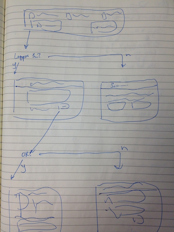
I do a lot of drawing, when I go to ‘design’ something. Really, I’m just trying to fool myself into thinking I’m some sort of ‘designer’, doing ‘wireframes’ - but I’m not, because my drawings are a pile of rubbish (see example). What I do end up doing though, is thinking as I doodle, and take notes across the page. By the end of the process, I have a pretty good idea of what I change.
Some of the key things I decided were:
- The body font had to go - what I had hoped would be a lovely, slightly old-fashioned-but-still-somehow-modern look turned into something that looked just a tad messy. Along with the copious use of
sans-seriffonts elsewhere on the site, there was a lot of inconsistency here - My blog posts always end up long. I should add in more images to break up the content and make things easier to read
- I didn’t like the listing of posts on the homepage - I felt that it was an unnecessary impediment to visitors seeing what content I have for them.
- I refer to Github projects a lot - I should be able to ‘feature’ them somehow for those readers who don’t know what I’m talking about.
Typographical Inspiration
As I’ve said, I liked the way that mojombo’s blog had a nice, slicked-back look to it, and decided that this was the sort of thing I wanted to pursue. I also decided that since consistency and readability was a priority for me, I would focus on trying to get post body copy looking the best.
I had stumbled across Mark Boulton’s blog a few days previously, and took some of his lessons on board from there - in particular, I took the measure of my old blog, and found that the lines were a bit too long - between 80 and 90 characters. I also found that the line-spacing (Sorry, leading), didn’t quite match the word-spacing.
Once I had some ideas for basic typographic improvements, I then had a look around Google Web Fonts to find some feature fonts for headings and important copy. I really liked the look of Tom Ward’s blog, which used a nice clean serif font for the headings that contrasted well with the sans-serif body copy. Eventually, I stumbled across Arvo, which fitted my needs perfectly.
Since my blog is powered by Jekyll, I also took a look through the list of Jekyll sites that are maintained on the wiki. This had some typographical and design stuff, but most of all, it allowed me to explore what might be possible to add to my posts and my homepage. It’s here I got the idea to add my ‘Featured Projects’ section to the bottom of some of my posts, and to show a ‘snippet’ of content for the latest 5 blog posts on the homepage, along with a list of all posts further down the page.
Implementation and Experimentation
I used LESS for implementing the CSS for the new blog layout and typography. I’d originally begun using LESS with Twitter Bootstrap (which enhances ‘my’ design capabilities significantly).
I set the base font-size on the body element, so that I could use relative font sizes from there on, and instructed the page to use that workhorse of fonts, 'Arial', 'Helvetica', sans-serif. I did try a few other fonts, but in the end settled on Helvetica, largely due to:
- Standardization - it’s an expected and familiar font for readers
- Adaptability - it’s suitable for a broad range of contexts and uses
- Legibility - Helvetica/Arial remains legible at a range of sizes
To fix up the measure (which should be about 70 characters across), I used a smaller single-column layout. I used a width of 50%, which at a width of 1280px, yields an average measure of just over 70 characters. I prefered a fluid width for this column, so that it can scale a bit more gracefully between resolutions, and I added a media query or two to change the width to 90% once the resolution drops below 767px, so that at that size, I’m not wasting any page.
After these few improvements, everything was looking way better. As is the way with these things though, discovering the best fit for all of these, along with some other minor tweaks, took the best part of a day.
What I Like
I do like the refactoring work I’ve done overall. I feel like everything is a bit more utilitarian and back-to-basics, but in a good, clean way. It still looks professional and makes it clear that I can wrangle CSS, without being too much for what it is.
I’ve placed more images on a couple of my posts, and I also like how this is working. What was previously mostly drab posts (whose content is fascinating, I assure you!), has now been broken up a wee bit.
I also think that the way I’m featuring Github projects is working well, and will hopefully help people out a bit if they’ve just scanned through a post and want to find out more about a specific project I’ve mentioned.
The last thing I’m happy with is the homepage. I was a bit worried about achieving the right balance here, but I think that it’s about right. I now ‘feature’ the latest 5 posts on the homepage, with, hopefully, just enough content to get visitors interested in clicking through to the full article, but just below that I also include a full listing of all posts. This means that for an casual visitor, there’s info right there for them to find something interesting, and for the return visitor, there’s a way for them to refer back to a previous post without having to leave the homepage to dig through an archive.
What I don’t like
There’s not actually too much - what I don’t like are things that I can fix in improvements later down the track.
The main thing I’d like to have is captions underneath images. As I’ve mentioned in previous posts, I use Markdown for writing posts, and markdown happens to not support the <figure> or <figcaption> tags, which are perfect for an image/caption scenario. I write this markup in HTML for some blog images, but I’d really like it to happen straight off a Markdown image tag. I should be able to fix this by adding some javascript to wrap each image tag in a figure element, with the caption being based on the image’s title attribute.
Another thing I’d like to do is properly attribute images and resources I use. A lot of the images that I use are in the public domain (usually out of Wikimedia Commons), but some do require proper attribution, which I’m not currently giving. I’m still thinking about the proper way of doing this - I may be able to just add it to the image caption, once I’ve got my figure tags appearing properly, or I may do something like the ‘Featured Project’ boxes I’ve got at the bottom of posts that reference Github projects. Hm.
Overall, I’m quite pleased with this. There’s certainly some improvements to be made, but I feel like I’ve built up something that is a bit less proprietary and based on previous work, and a bit more tailored to me. Along the way, I’ve even managed to learn a few things about typography, LESS, and advanced Jekyll functionality! Win!
Got any comments about more improvements I could make? I welcome tweets or private messages on Twitter - @sudojosh